
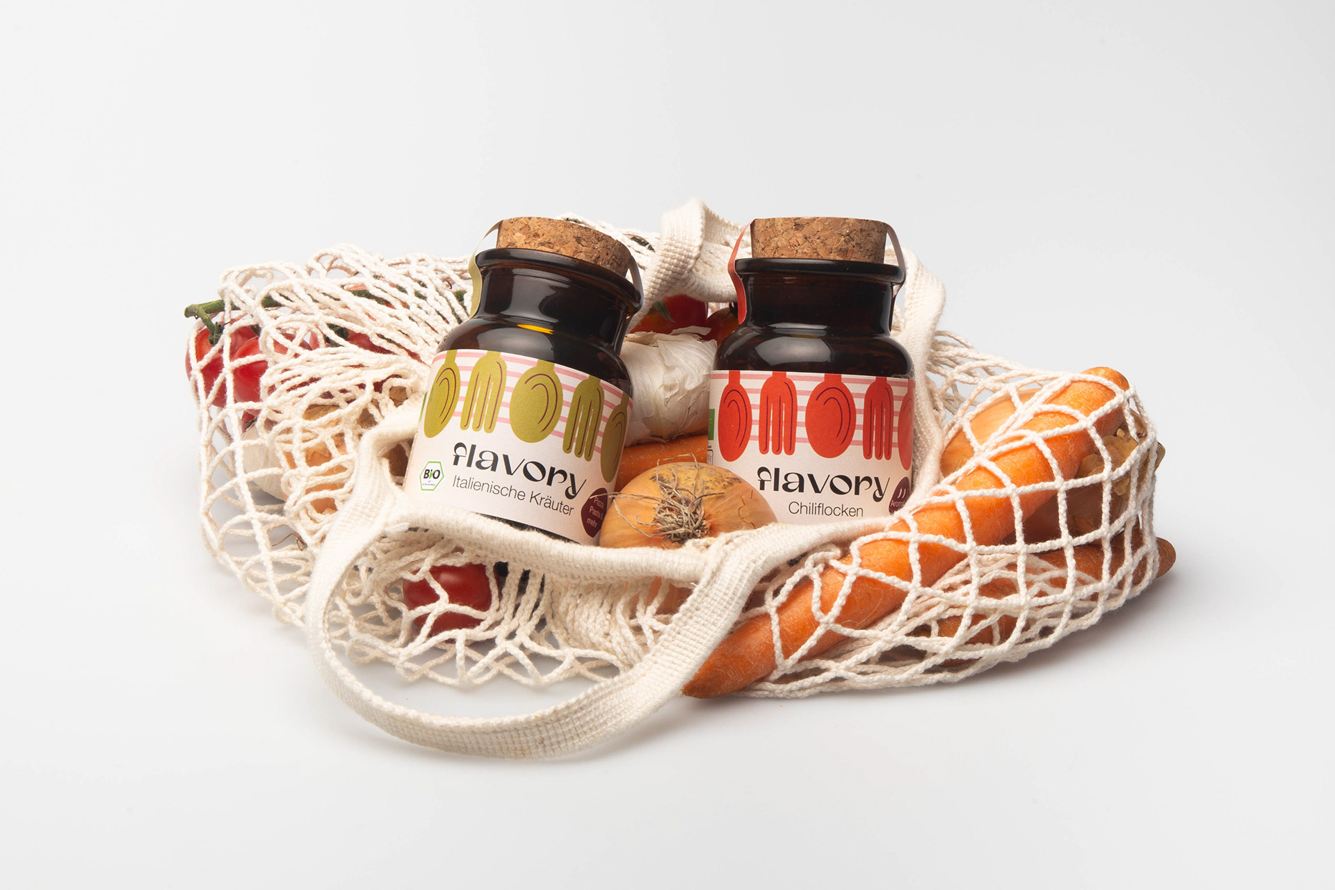
Flavory
Responsibility, organic quality, natural ingredients, and variety. These core values are reflected in the spice packaging for the brand “flavory”. Based on an analysis of the company, its target audience, and the competition, a colorful and modern design was created that both reflects the two founders and their values and is perfectly tailored to the target audience.
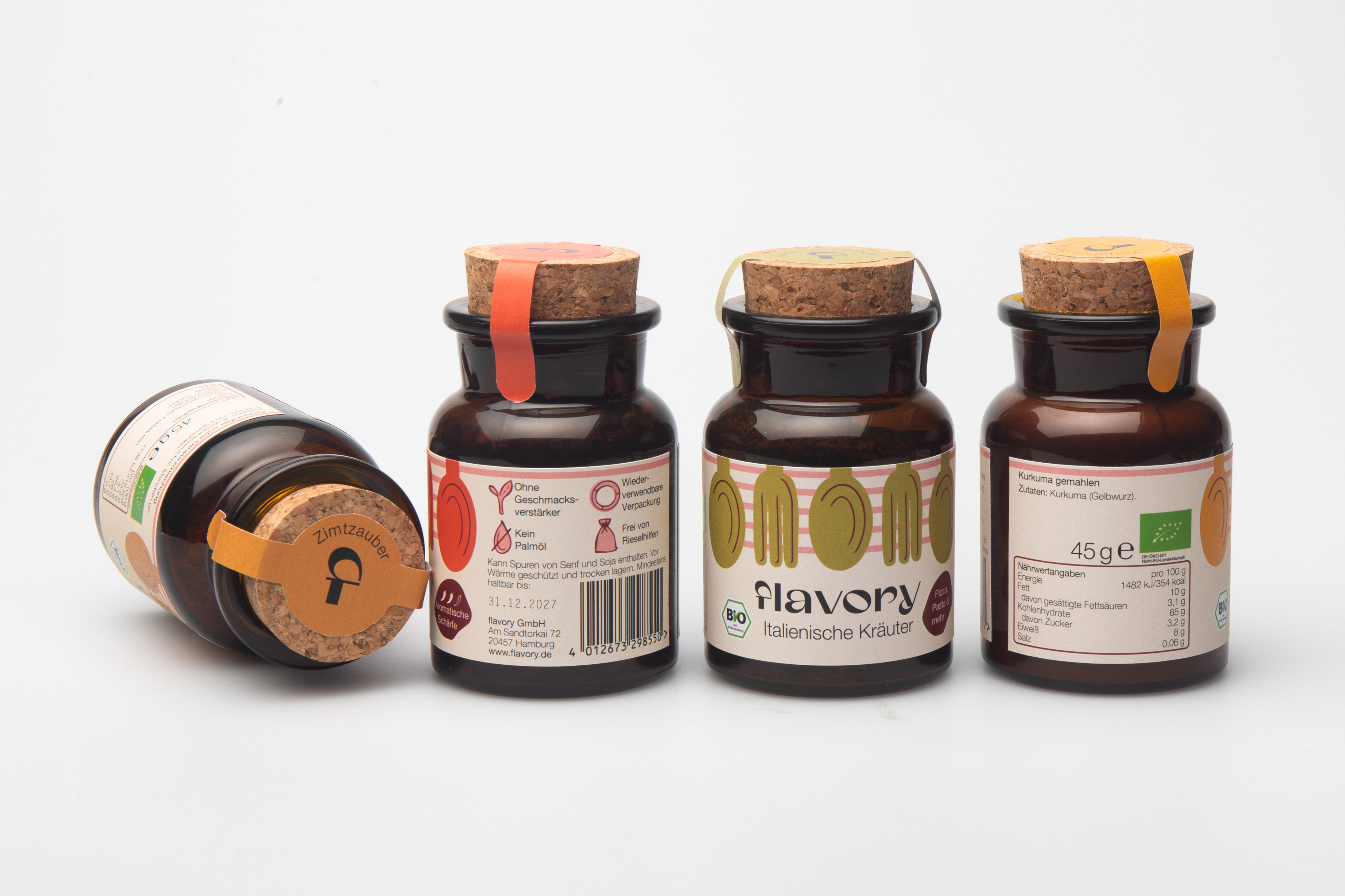
The amber glass jar with a cork lid protects the spices from light, ensuring they maintain their high organic quality over time.
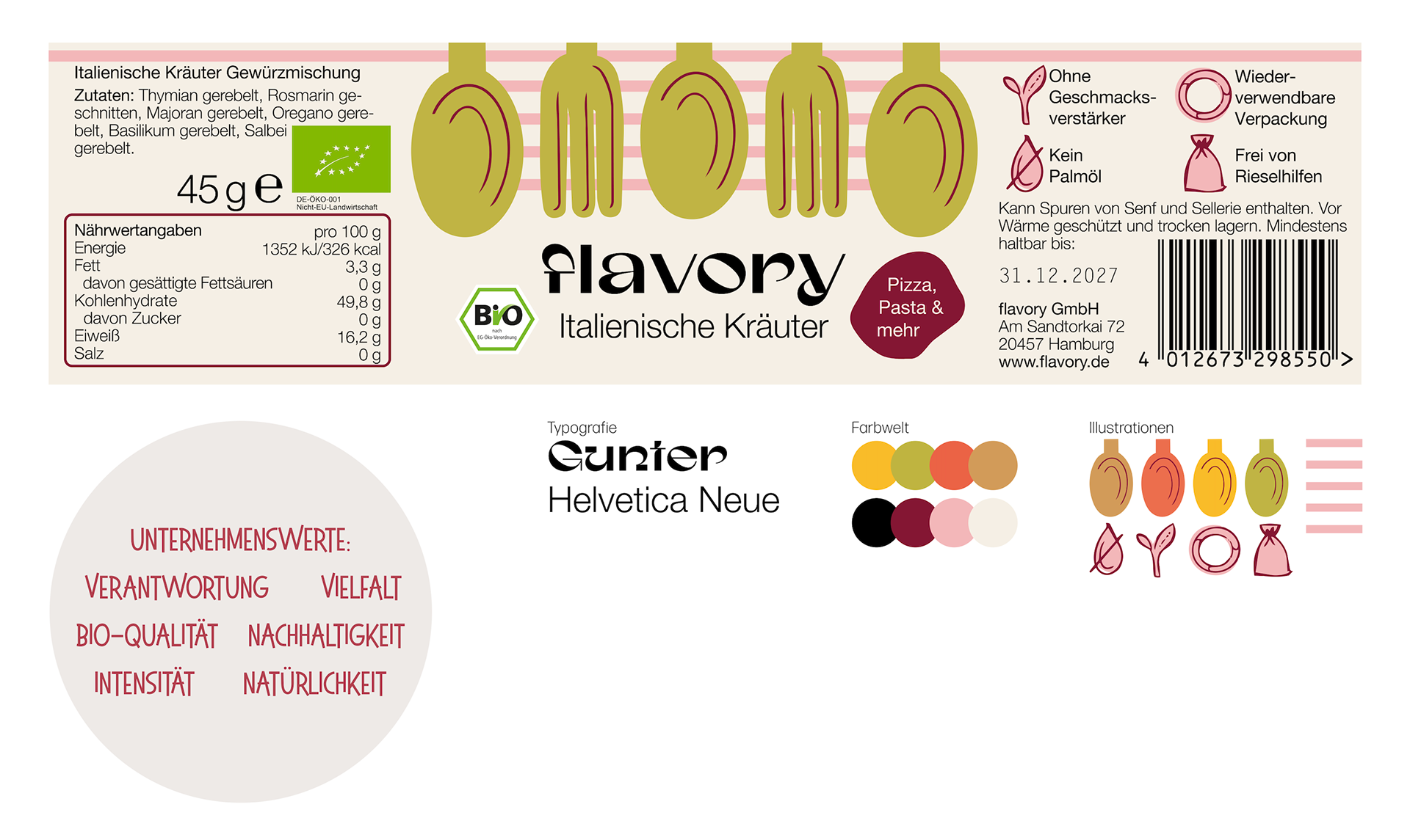
The brand name “flavory” is easy to understand and implies intensity. Combined with the Gunter sans-serif font, the word mark conveys high quality and variety. It is complemented by the sans-serif font Helvetica Neue, which remains highly legible even at small font sizes.
The color scheme of the design is based on the colors of the spices, complemented by modern accent colors, thereby emphasizing naturalness and sustainability. The illustrations—spoons and forks combined with stripes—embody this diversity. The spoons and forks, in particular, stand out on supermarket shelves and ensure brand recognition. The jar features a seal label that secures the lid and builds trust.